The Apple Watch is an amazing piece of everyday technology. Everything about the device, from setup to use, is very intuitive and very fun.
I’ve never had the battery dip below 60% in a single day; I bet I could make it through a couple days without needing to enable Power Reserve mode.
There are naturally a few complaints that I would like to express before I begin. Setup and syncing is slow, though not finicky. It works for the most part, but, for example, if you accidentally tap a switch to install an app accidentally then quickly tap it off to uninstall, the app can get stuck in a perpetual “uninstalling…” state.
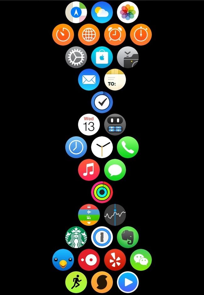
App organization can be pesky, but once you figure out how Apple chooses to shift icons around, it becomes a snap. I’ve found that a vertical arrangement that limits horizontal panning is very effective and easy to use:
Finally, the lack of customization of the faces is somewhat bothersome. Apple has a very specific aesthetic for each one, but that aesthetic also prevents customization. You cannot, for instance, change the color of any of the complications on the face besides the secondhand (and date, but that uses the secondhand color) with the simple or utility faces. The chronograph face only allows you to change the color of the background, not the complications or hands; it is the only analog face to do this. The index hour/minute markers are also not swappable between displays, so if you like the hands of the simple face and the index of the utility face, forget about it!
The watch faces all seem to revolve around the same formula: something in the middle and four complications in the corners. This simple formula is then copied across nearly all of the faces, making them seem repetitive and too similar for my taste. However, the watch face says little to onlookers about the aesthetic of the watch itself, as the user is the only individual to regularly view the watch face.
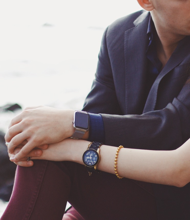
The apple watch is a brilliant fashion accessory. The stainless steel and gold models are stunning, both on the wrist and off. The watch is sleek and elegant but also slightly, yet deliberately, frivolous. The photos online do not do the device justice, as with any watch. You simply must experience it in person before opining on the watch’s aesthetic.
The watch fits perfectly with the iPhone, iPad, and laptop design ethos. It is both predictable and fits the existing line-up: it is what Braun would have done: build on the legacy.
This conclusion ignores the awful hues Apple chose for the Sport model. The obscene pink and green hues apple chose barely fit spring pallets and will certainly not fit autumn, summer or winter. The all-black and all-white straps are only complementary to their respective models (space grey + black vs. silver + white), not to each other..
However, the versatile stainless steel models can be matched with nearly any outfit and complexion, as can any similar colored classic watches. Apple’s focus on neutral and jewel tones with the leather straps enable the device to complement nearly every season of color analysis – from my own clear winter to a light summer.
This distinction demonstrates the difference between the stainless steel and sport models – the Sport models are not meant to be worn regularly like the stainless steel models. The colors echo Nike’s neon style guide. Neons are popular in fitness fashion not only because they accentuate small details but also because they are highly visible – from vehicles spotting runners at night to individuals spotting someone across the gym. The Sport models are highly visible as a result – after all, its not just a fitness tracker, its an Apple Watch!

I find myself using this watch to replace my phone. When I am out and about, for instance, it frees me from pulling my iPhone out of my pocket. This may seem irrelevant, since I glance at my watch just as much, but there is quite a staggering difference in these two behaviors. When I use my phone, I unlock with Touch ID, open Notification Center, tap a notification, interact with an app, press the home button, check Twitter, and so forth. With the watch, I simply raise my wrist. If the unread indicator is lit, I explore. If not, no need to worry; I just lower my wrist.
It is this in this distinction that the Apple Watch is able to make us more human. It is not the animated emojis or Digital Touch, nor is it the quick access to my friends’ contacts. It is the liberation from our phones that allows us to participate more, converse more, explore more; it provides us with an excuse to not use our phones. That, I believe, is the magic of the Apple Watch.