The only metric I have to gauge traffic to this website is AWStats, an open-source logfile analyzer that runs through my CPanel. I do not use any other forms of tracking.
AWstats is a great tool because it can generate charts and tables of various data. It is simple, lightweight, and easy to operate. There is one problem that will impact users’ ability to visualize trends in the data, however:
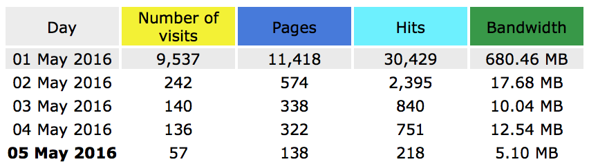
Excel interprets the bandwidth column as a string and not a type of file size. Excel does not understand file sizes by default either, so to visualize bandwidth data the entire column needs to be converted formulaically.
Luckily, this can be accomplished with a series of nested =IF statements that determine the size the letters denote and multiply or divide the numbers by the correct amount:
=(IF(RIGHT(F3,2)="MB",LEFT(F3,(FIND(" ",F3,1)-1)),IF(RIGHT(F3,2)="KB",LEFT(F3,(FIND(" ",F3,1)-1))/1024,IF(RIGHT(F3,2)="GB",LEFT(F3,(FIND(" ",F3,1)-1))*1024,0))))*1This formula uses MB as the default unit.1 If the formula sees the letters "MB" it will take all of the numbers to the left of the space character. If it does not meet this case, it checks for "KB". If it finds a match, it takes the all of the numbers to the left of the first space character and divides it be 1024 to get the proper quantity in MB. If it still has not found a match, the formula checks for "GB". If it finds a match, it multiplies all of the numbers to the left of the first space character by 1024 to get the quantity in MB. Finally, if no matches are found, the formula outputs 0. Multiplying this result by 1 ensures it is changed from a string of numbers to a number.
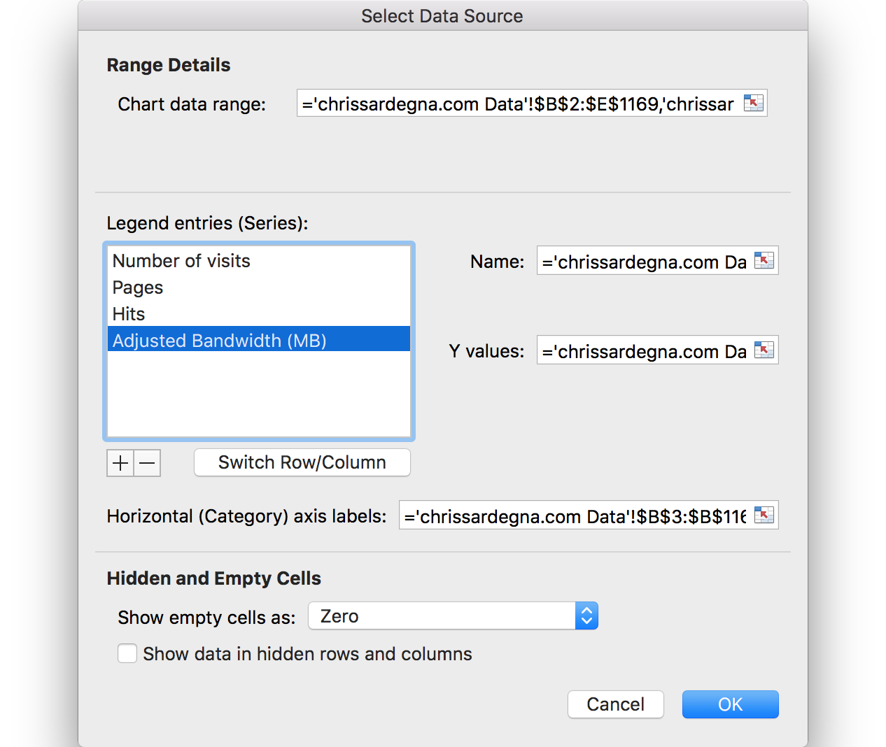
The entire data source is now 5 columns. To visualize this, select the relevant data and build a new chart. In the Data Source Selector delete the original text-formatted column so it looks like this:
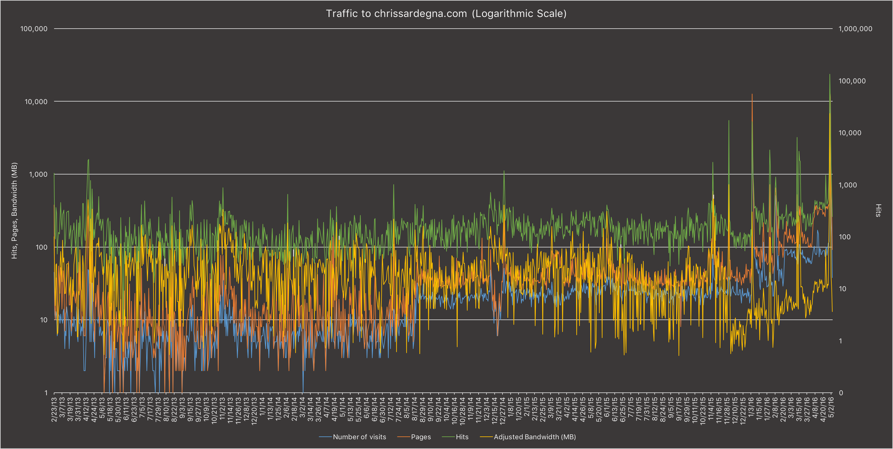
To better visualize the data, use a log scale. This allows charts that plot large spreads to be more easily consumed, as massive spikes will not obscure small changes. Apply some visual styling and voila!
This equation would be made much simpler by the =IFS function, which is only available on Windows at this point. Hopefully, in the future, Microsoft will also allow Excel to interpret file sizes properly.
I chose this because it was by far the most common in my data. ↩︎