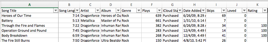
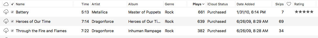
iTunes, Apple’s media organizer program, is both panned as bloatware and praised as a one-stop-shop. Regardless, iTunes stores a wealth of metadata locally that make it relatively simple to visualize trends within our often extensive libraries. It is trivial to copy the raw data from iTunes and use it in Excel, even with Apple Music1. Simply go to the Songs tab in the iTunes sidebar, press ⌘A, tab over to Excel, and press ⌘V:
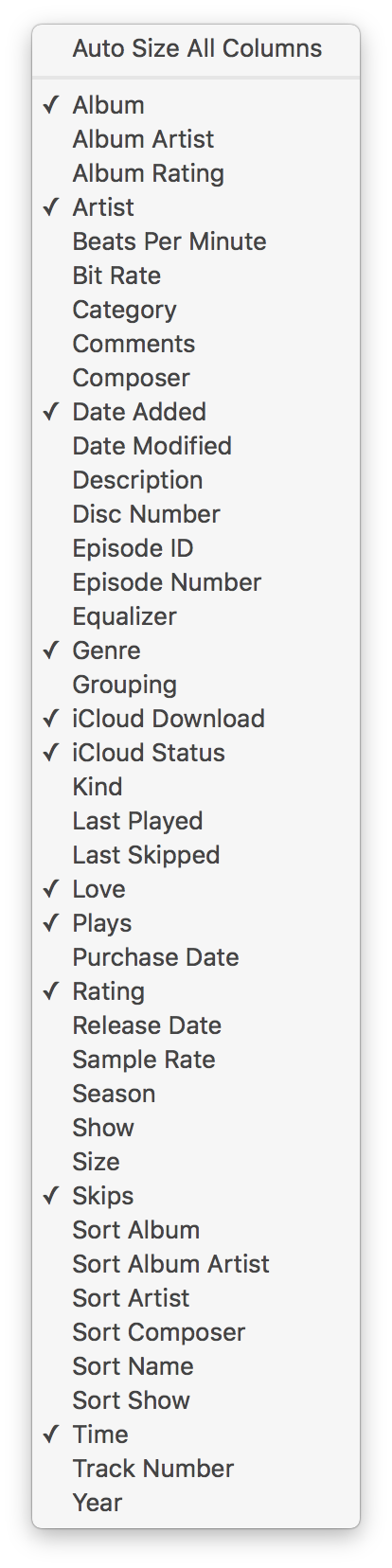
To select which data iTunes displays, right-click on the column names at the top of the screen and check the proper items. For this exercise, use the following columns in iTunes:
Song Title
Song Length
Artist
Album
Genre
Plays
iCloud Status
Date Added
Skips
Loved
Rating
After pasting to Excel, manually add the proper headings to sort the data like so:
For the most part, the data is filled out if the library has been maintained. The Filter toggle on the Data tab allows for ordered sorting and excluding data within this dataset. However, to crunch the numbers, some of the data needs to be formatted differently.
Instead of editing the data itself, add columns to the right of the data. This way, when more data is added, the formulas can be preserved and filled down. This also allows for PivotTables to refresh and not have to be resized when more data is added.
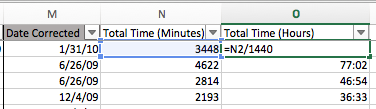
The Date Added column from iTunes includes both the date and time the song was added, i.e. 1/31/10, 6:14 PM. However, this is formatted as text and cannot be sorted or grouped. To sort this properly as text, add a new column to the right called Date Corrected. Filling this column with the formula =DATEVALUE(LEFT(I2,FIND(",",I2&”,”)-1)) will find the proper date. The =LEFT portion will look for the comma character in the Date Added column and pull the text to the left of it. The =DATEVALUE portion forces the text it pulls2 to be formatted as a date.
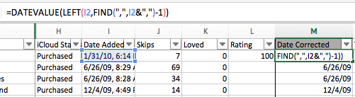
Finally, in the home tab, select the Date Corrected column and set the format to “Short Date” in the drop-down menu. This will ensure that this data is sortable and groupable by date later.
The last two columns will calculate how long an individual song has been played. Since the data includes the song length3 and the count of plays, it is almost trivial to multiply these together. However, it is a little messy.
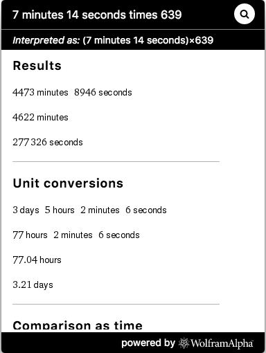
To calculate the minutes a song has been played4, create a new column called Total Time (Minutes) and use the formula =((HOUR(C2)*60+MINUTE(C2))*G2)/60. This formula takes the hour value of the song length and multiplies it by sixty. It then adds the minute value of the song length to the new hour value. It then multiplies this by the number of plays the song as and finally divides the total by 60.
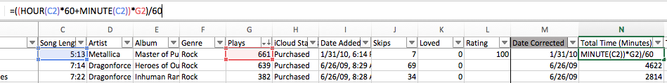
It is important to note that while Excel sees the Song Length column as hours and minutes i.e. HH:MM, it is in fact MM:SS. This is why it gets divided by 60: if we do not divide at the end, we have a count of seconds, not the count of minutes. This formula is a little messy but it gets the job done. Sanity check the result with WolframAlpha5:
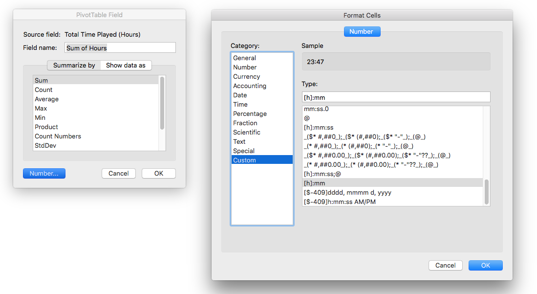
The hour calculation is far simpler but it needs to be formatted. Create a new column called Total Time (Hours) and use the formula =N2/1440. This will divide the total time in minutes by 1440, which gives us the decimal time format for hours in Excel.
From there, apply the custom format [h]:mm to the Total Time (Hours) column:
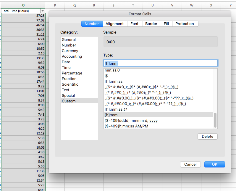
This will show the hours in the standard HH:MM format.
Now that the data is all clean and sortable, it can be visualized. Each sheet will have its own separate PivotTable and chart for simplicity’s sake. The Data sheet contains the cleaned data from iTunes.

The first step to creating all of these charts is to create a PivotTable. Select any cell on the Data sheet and set the range to Data!$B:$O6. This way, the PivotTable will include all of the data and that added later since there is no lower bound on the rows. Make sure each PivotTable is placed on its own sheet.
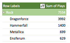
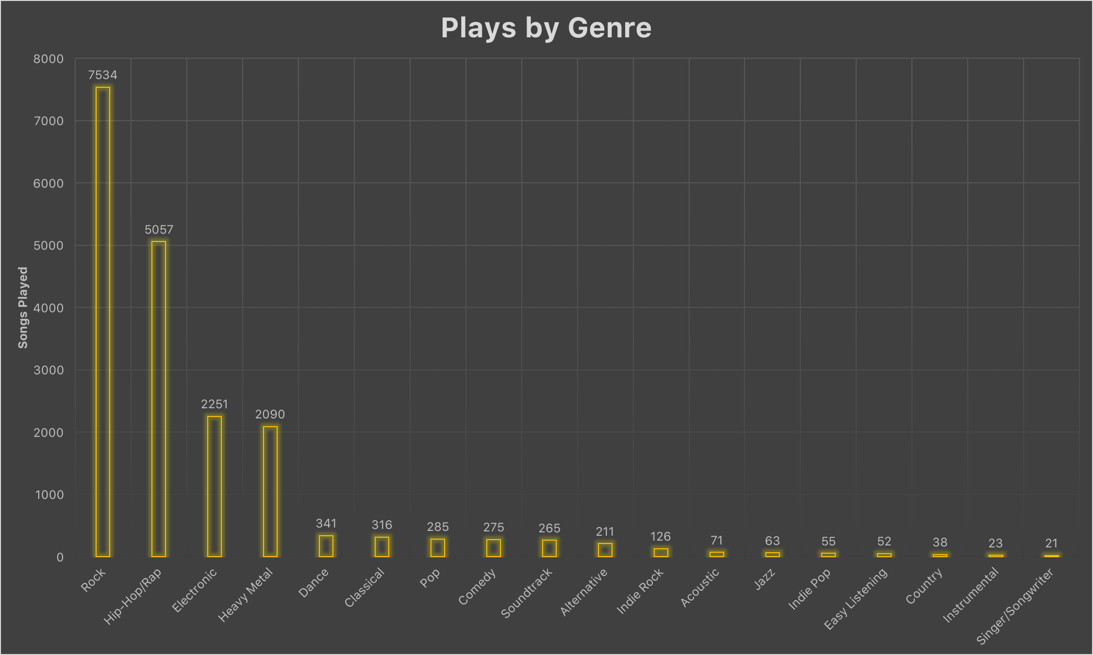
This PivotTable will use the Genre, Artist, and Plays columns in this order:
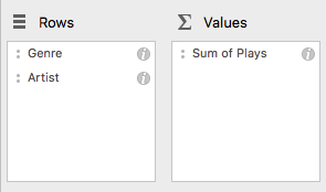
This creates a PivotTable of Genres that can expand to show the underlying Artist:
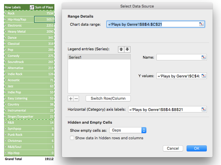
From here, create a chart. Select any cell in the PivotTable and insert a Clustered Column chart. In the Data Source Selector, set the Y-Values to the Sum of Plays column and the horizontal axis to the Row Labels column.
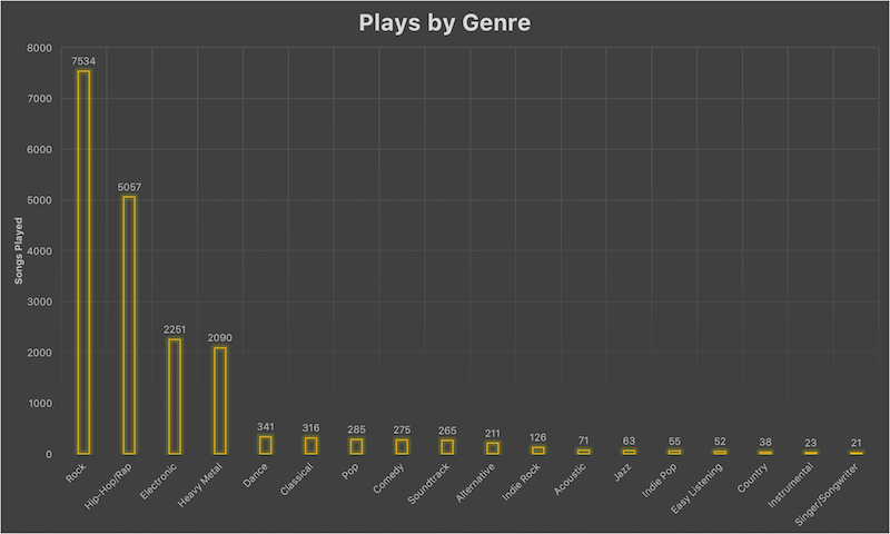
Apply some styling and voila:
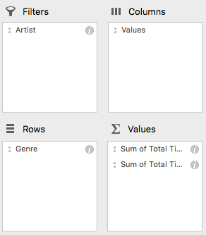
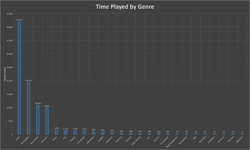
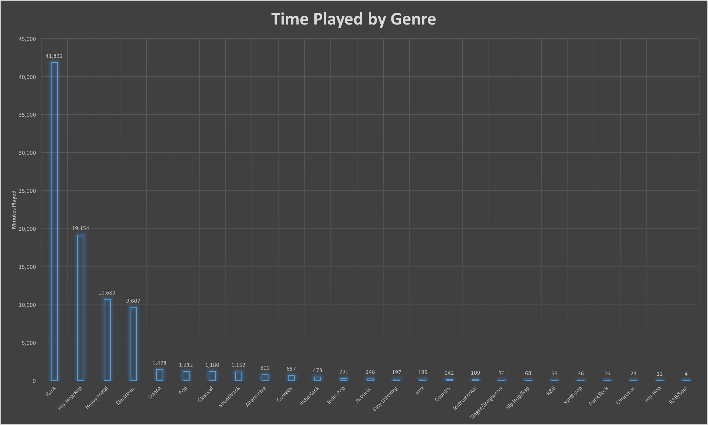
This PivotTable will use the Artist, Genre, and both Total Time columns created earlier.
Artist is set as a filter so it is possible to exclude certain artists from the PivotTable. Also, ensure both Total Time columns are summarized as Sum and not Count. Finally, ensure that the `Total Time (Hours) column has the correctly applied number formatting:
The Field Name should be edited for brevity’s sake. Create the chart the same as before: in the Data Source Selector, set the Y-Values to the Sum of Minutes or Sum of Hours column and the horizontal axis to the Row Labels column:
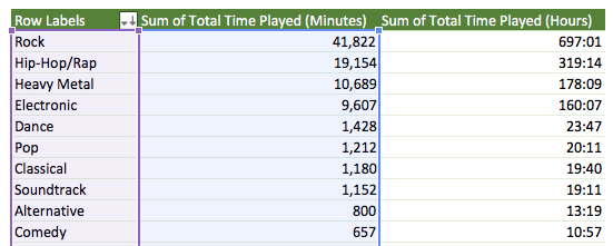
Finally, apply some styling:
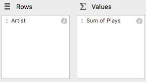
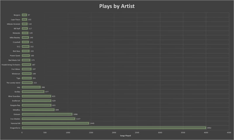
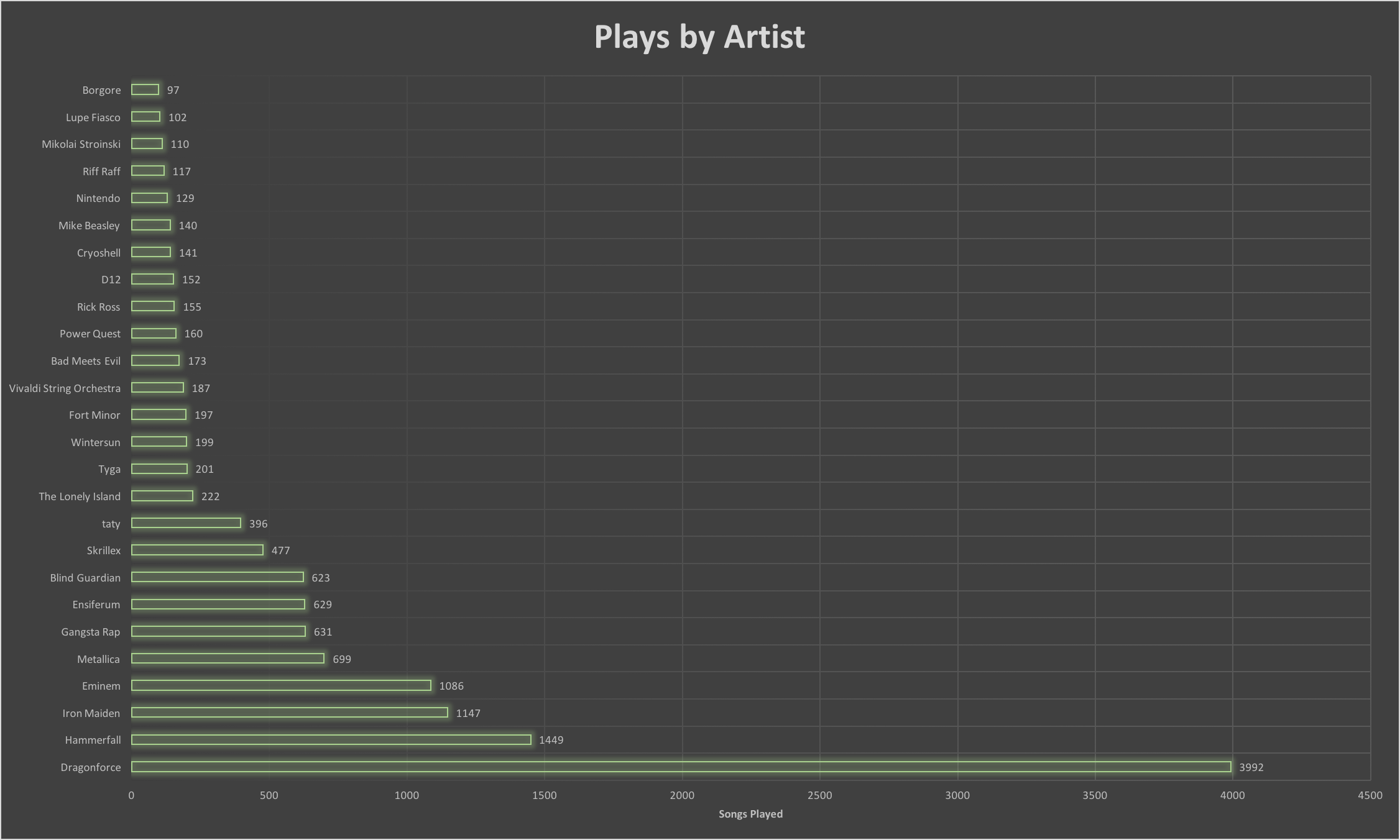
This PivotTable will use the Artist and Plays columns in this order:
From here, create the chart. Select any cell in the PivotTable and insert a Clustered Column chart. In the Data Source Selector, set the Y-Values to the Sum of Plays column and the horizontal axis to the Row Labels column. Apply some styling and enjoy the chart:
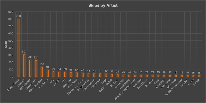
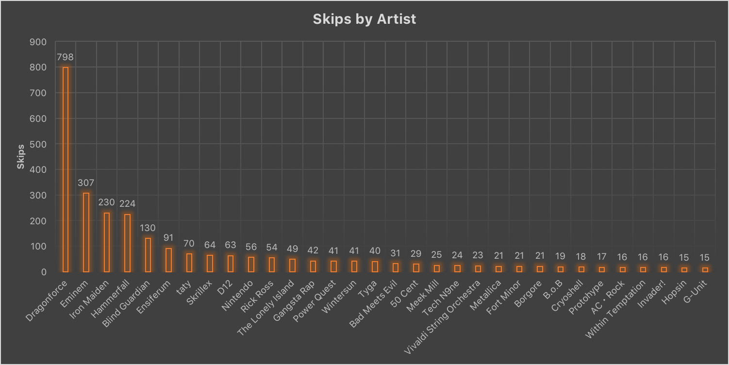
This PivotTable will use the Artist, Song Title and Skips columns in this order:
Use the Skips filter to remove (blank) because many songs will have 0 skips.
From here, create the chart. Select any cell in the PivotTable and insert a Clustered Column chart. In the Data Source Selector, set the Y-Values to the Sum of Skips column and the horizontal axis to the Row Labels column. Apply some styling and enjoy:
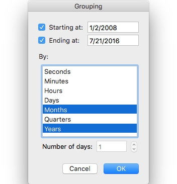
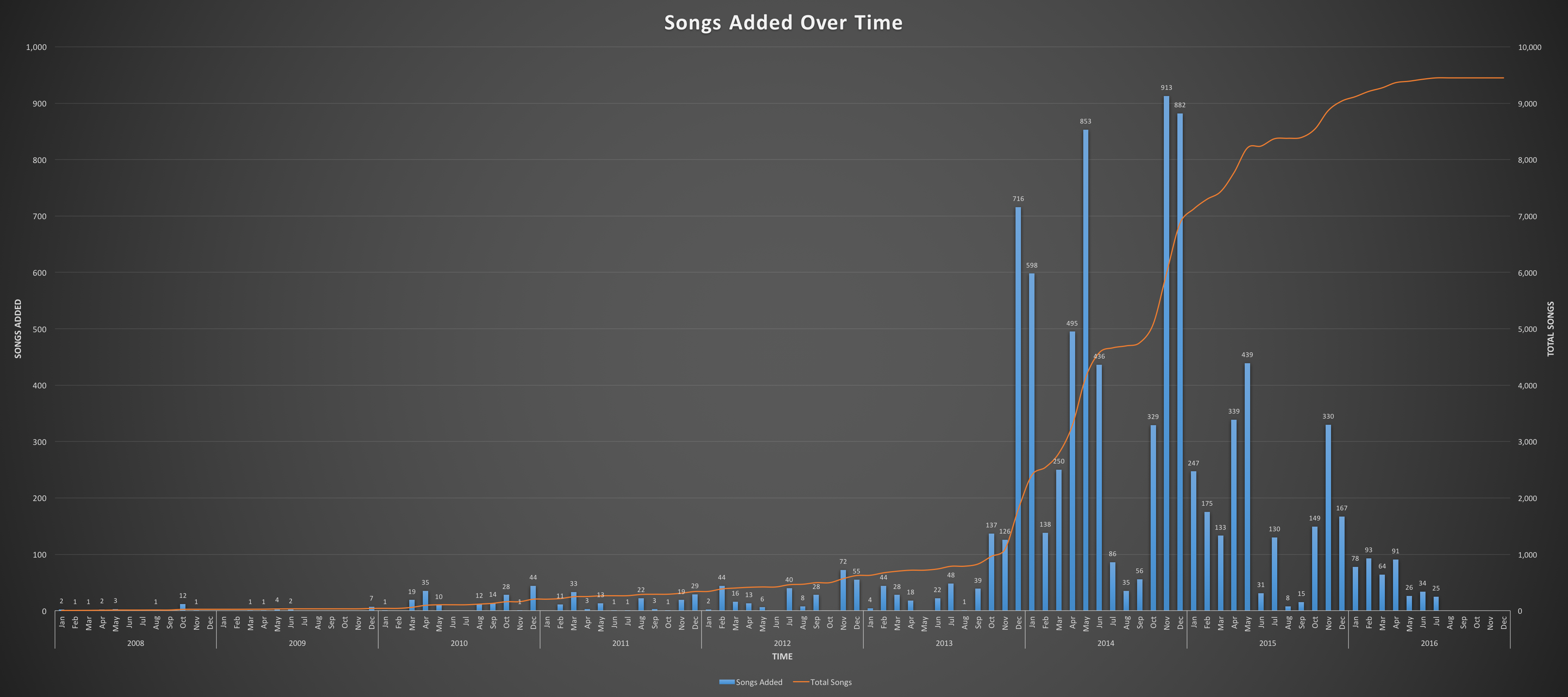
This is by far the most complicated visualization in this set. The PivotTable is relatively simple in design. It uses the Date Corrected and Song Title columns in this order:
The Years entry is a result of grouping. To group by month, right click on the dates in the list and select Group and Outline. Ensure the date range is accurate for the data and ⌘-Select Months and Years.
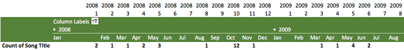
This results in the following PivotTable:

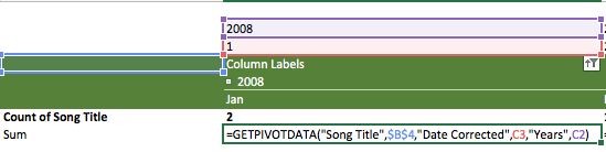
From here we need to calculate the total number of songs that accumulates over the months. To do this, add two columns on top of the PivotTable. The top column will contain the Year we are targeting and the borrow column will contain the month, like so:
This allows us to create a formula that references the arguments required to pull cells using =GETPIVOTDATA. Ordinarily, a single reference to a PivotTable cell will result in something messy like =GETPIVOTDATA("Song Title",$B$4,"Date Corrected",1,"Years",2008). By adding the year and month, we can replace those arguments with relative references. Once the references are relative, they can be flash-filled across rows and columns as necessary.
To calculate the accumulated song count, we leverage these two new rows. Replace the 1 following the “Date Corrected” argument with a reference to the cell containing 1 above the PivotTable. Do the same for the 2008 following the ”Years" argument. The formula should look like this: =GETPIVOTDATA("Song Title",$B$4,"Date Corrected",C3,"Years",C2).
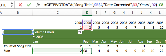
This formula is only used for the first cell. The second cell will read =GETPIVOTDATA("Song Title",$B$4,"Date Corrected",D3,"Years",D2)+C8. The +C8 adds the current month count to the previous sum.
This formula can be filled all the way across the entire PivotTable. It will calculate the accumulated number of songs on the monthly level7.
Finally, we can build the chart. We will need two axes to graph the data: one axis for the songs added per month and one for the cumulative songs in the library. Select any cell in the PivotTable and add a Clustered Column chart. In the chart builder, add two Series: Songs Added and Total Songs. Set Songs Added to the PivotTable range called Count of Song Title. Set Total Songs to the range created underneath the PivotTable that calculates the cumulative number of songs.
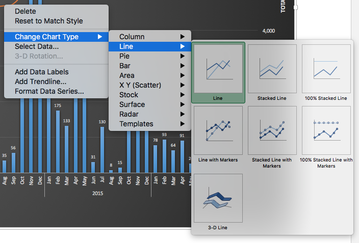
Once the basic chart has been created, right-click on the bars that represent Total Songs and select Change Chart Type > Line > Line.
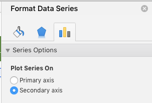
Next, double click on the line and go to the third tab on the Format Data Series sidebar on the right. Under Series Options set Plot Series On to Secondary Axis.
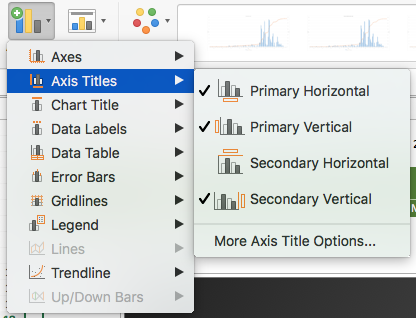
Finally, select the chart and use the Add Chart Element button on the Chart Design tab.8 Add the necessary labels to explain the chart.
Finally, the chart is competed.
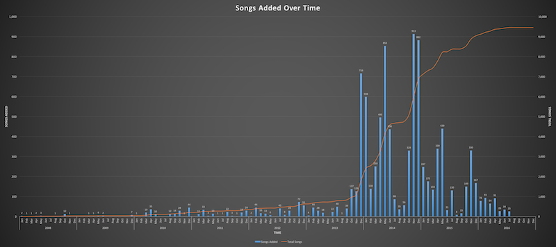
Excel’s PivotTable functionality allows for a deep dive into iTunes metadata. Although complicated at times, the visualizations it creates are quite telling about our music listening habits.
The Excel sheet I used can be downloaded directly or accessed in this Google Sheet.
To use the sheet, structure your iTunes songs tab exactly like this:
Copy everything and paste it in cell A2 on the Data sheet. Copy the formulas on the right down if needed.
Discussion: Hacker News | r/Visualization | r/DataIsBeautiful
However, only statistics on songs added to your library will show up. If the Apple Music songs are in a playlist but have not been added to your library they will not show up here. ↩︎
This text will always be the proper date. iTunes formats the data like 1/31/10, 6:14 PM, so pulling the text to the left of the comma results in 1/31/10. If we do not use =DATEVALUE it will not be interpreted as a date. ↩︎
Excel formats this as time, so a 7:32 song will read as 7:32 AM. More on that later. ↩︎
Skips in iTunes are counted when you advance the track after having played more than 2 seconds but less than 20 seconds. If this case is hit, a play is not counted. If this case is not hit, a play is counted. Thus, if you listen for more than 20 seconds, iTunes considers it a play. This calculation will this not be entirely accurate as there is no way to see exactly how long you listened to a song before skipping, however it will be a good ballpark. ↩︎
I leave Column A blank; if you do not, use `Data!$A:$N or whatever range fits your data. ↩︎
You can do the same for weeks, quarters, days, etc. as long as there are columns to reference for the necessary arguments. ↩︎
You will not be able to see the chart design tab if the chart is not selected. ↩︎